Problem
During the early stages of the COVID pandemic, World United identified a critical shortage of testing kits and Personal Protective Equipment (PPE) nationwide. The existing supply chains were overwhelmed, and many institutions, including schools and healthcare providers, struggled to access the necessary resources to keep communities safe. This scarcity created an urgent need for a dependable supplier that could quickly scale to meet widespread demand.
Solution
I crafted a brand strategy focused on trust, reliability, and clarity—key factors for a company operating during a public health crisis. By emphasizing World United’s commitment to accessibility and responsiveness, we positioned the brand as a steady and established partner. The visual identity and messaging were designed to convey reassurance and professionalism, helping the company connect with diverse audiences in both the public and private sectors.
Goals for Company
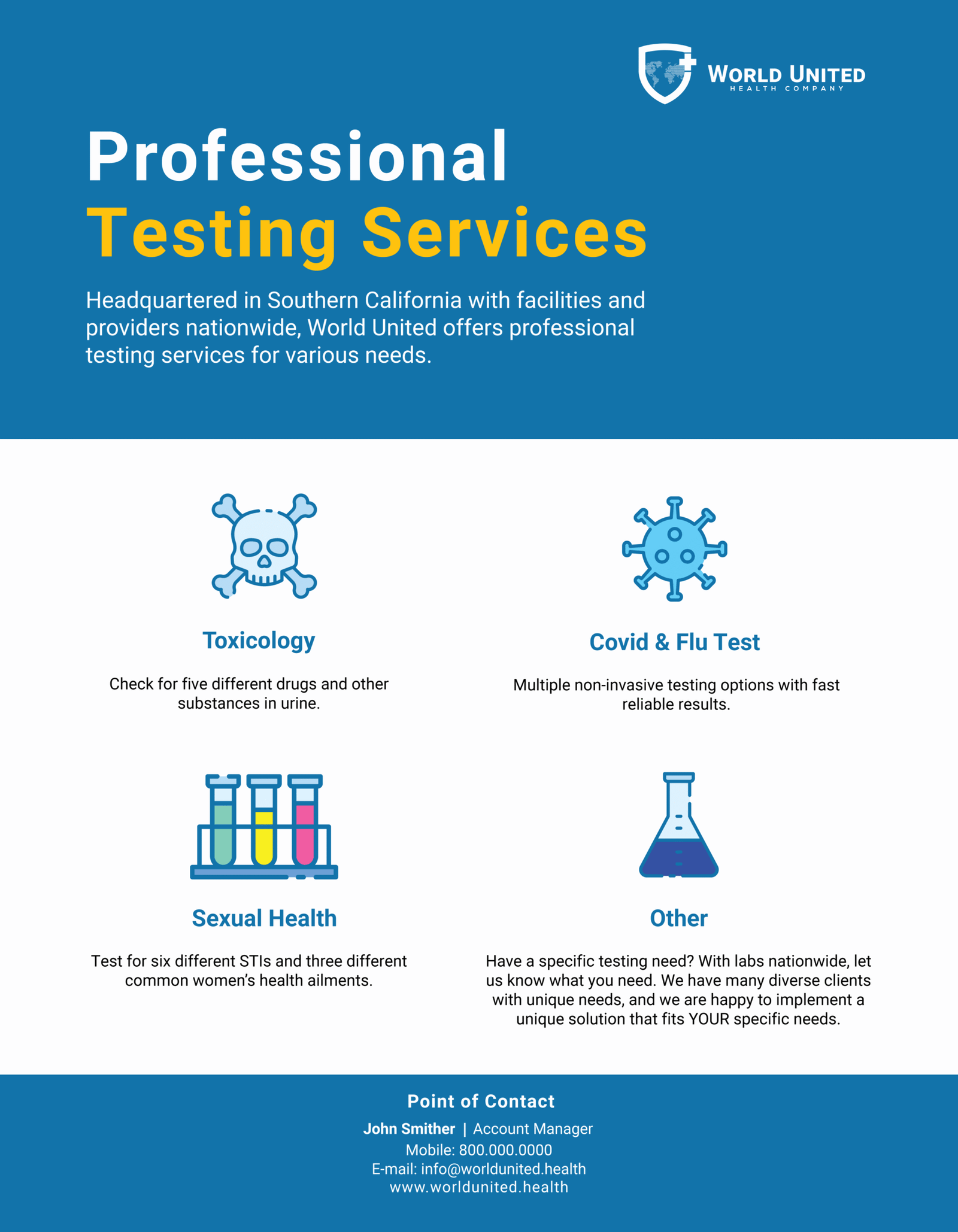
World United’s goal is to ensure affordable and accessible COVID testing and essential medical supplies across the United States. By directly serving hospitals, schools, and the general public, the company aims to be a trusted, reliable partner in delivering life-saving equipment during critical times.
Brand Strategy
The brand strategy centers on building confidence through transparency and dependability. World United is presented as a lifeline in uncertain times, combining pragmatic solutions with a compassionate approach. Messaging highlights the company’s dedication to safety, speed, and widespread accessibility, reinforcing its role as a critical public health ally. The brand voice is clear, authoritative, yet approachable to reach schools, hospitals, and community members alike.
Color
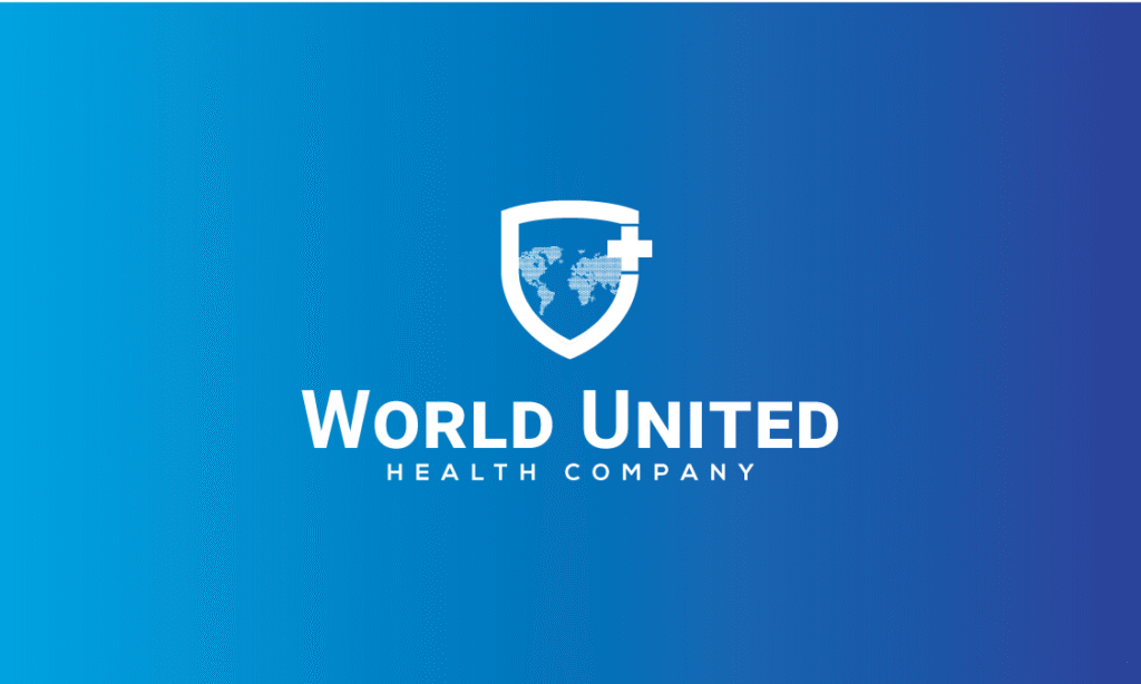
The World United logo uses a bold, clean typeface paired with a strong blue color palette, symbolizing trust, stability, and professionalism. Blue also conveys a sense of calm and reliability, key attributes for a company working in healthcare during a crisis. The logo design is simple but impactful, ensuring clear visibility across both digital platforms and physical signage, making it easily recognizable to a wide demographic.
SOLID BLUE
HEX
#119ACD
RGB
(17, 154, 205)
CYMK
(0%, 60%, 100%, 0%)
DEEP OCEAN BLUE
HEX
#253674
RGB
(38, 34, 98)
CYMK
(100%, 100%, 25%, 25%)
DEEP GRAY
HEX
#3A3A3A
RGB
(58,58, 58)
CYMK
(69%, 62%, 61%, 52%)
PURE BLACK
HEX
#000000
RGB
(0,0, 0)
CYMK
(0%, 0%, 0%, 100%)
Typeface & Hierarchy
For typography, we chose a modern, sans-serif font like Readex Pro and Roboto to reflect clarity and accessibility. The type is highly legible across all applications, from website content to printed materials, reinforcing the brand’s straightforward and dependable nature. The clean lines of the typography support the brand’s emphasis on professionalism while maintaining an approachable tone.
Readex Pro
Aa
Bold
Aa
Semibold
Aa
Regular
Aa
Extra Light
Roboto
Aa
Bold
Aa
Semibold
Aa
Regular
Aa
Extra Light
Stationery
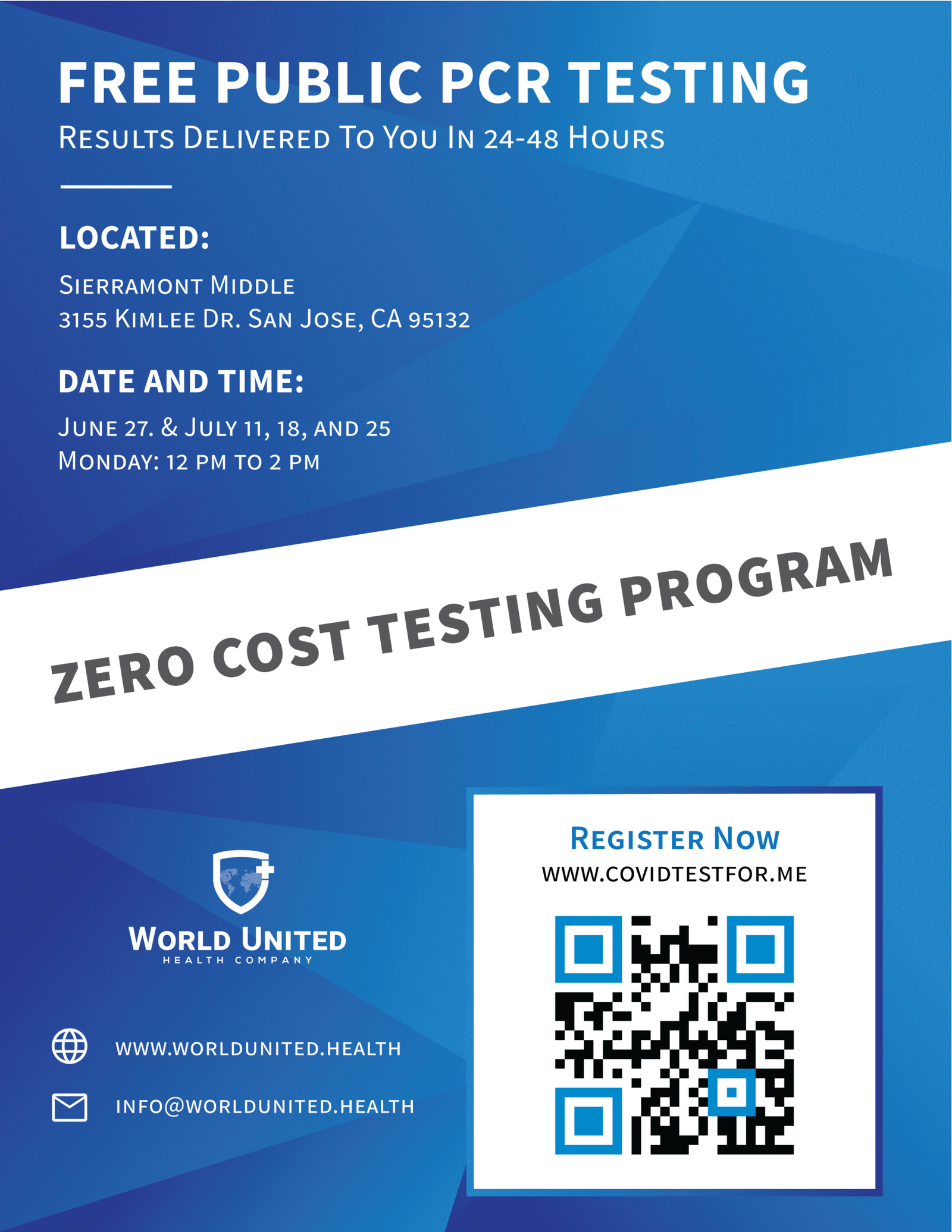
Print & Digital Advertisement