Problem
Careon Health faced the challenge of transforming a healthcare testing experience that was traditionally slow, impersonal, and difficult to access. Their goal was to create a brand that could deliver fast, reliable at-home testing while feeling approachable and trustworthy to a broad audience. The existing healthcare often felt clinical and intimidating, which made it hard to engage consumers who valued convenience, discretion, and fast results.
Solution
I developed a brand strategy that combined functional efficiency with empathy. By focusing on simplicity, speed, and a clean digital first experience, I crafted a brand identity that feels both modern and welcoming. This approach positioned Careon Health as an accessible, empowering healthcare partner, one that made testing and fits seamlessly into customers’ everyday lives.
Goals for Company
Careon Health aims to revolutionize access to medical testing by delivering easy-to-use test kits directly to customers’ homes. Leveraging modern telehealth technology, Careon provides rapid results—often within hours—while maintaining a focus on practical solutions and beautifully designed user experiences.
Brand Strategy
Careon Health is built around the idea of accessible, design-forward healthcare. By delivering at-home medical test kits and providing rapid results through telehealth, the brand empowers users to manage their health with ease and confidence. The strategy combines modern digital convenience with a human-centered approach, making healthcare feel less clinical and more personal—an experience that’s fast, secure, and beautifully simple.
Color
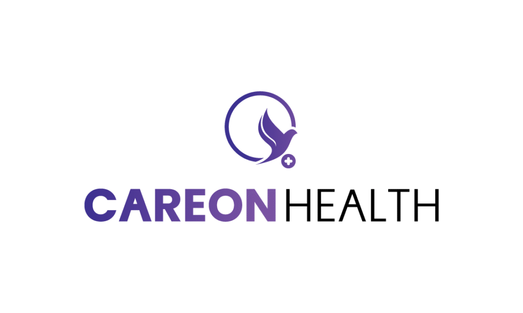
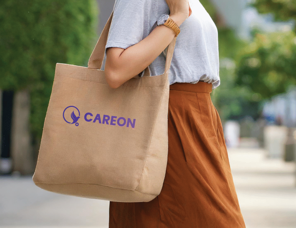
The Careon logo features a minimalist design with soft, rounded elements to evoke approachability and trust. A vibrant yet calming shade of purple is used as the primary brand color, symbolizing both innovation and compassion. This modern hue bridges generational appeal, offering sophistication for older users and a fresh, tech-savvy aesthetic for younger audiences, making the logo feel professional.
FAINTED PURPLE
HEX
#7952a2
RGB
(121, 82, 162)
CYMK
(62%, 79%, 0%, 0%)
NOVA VIOLET
HEX
#463a96
RGB
(70, 58, 150)
CYMK
(89%, 94%, 0%, 0%)
DEEP GRAY
HEX
#3A3A3A
RGB
(58,58, 58)
CYMK
(69%, 62%, 61%, 52%)
PURE BLACK
HEX
#000000
RGB
(0,0, 0)
CYMK
(0%, 0%, 0%, 100%)
Typeface & Hierarchy
Careon’s typography is clean, sans-serif, and highly legible, reflecting the brand’s commitment to clarity and user-friendliness. Fonts like Poppins and Radio Canada are chosen for their modern simplicity and digital optimization, ensuring the experience remains intuitive across all devices. The type design supports the brand’s tone of calm, competent, and forward-thinking, while remaining accessible to all ages.
Poppins
Aa
Bold
Aa
Semibold
Aa
Regular
Aa
Extra Light
Radio Canada
Aa
Bold
Aa
Semibold
Aa
Regular
Aa
Extra Light
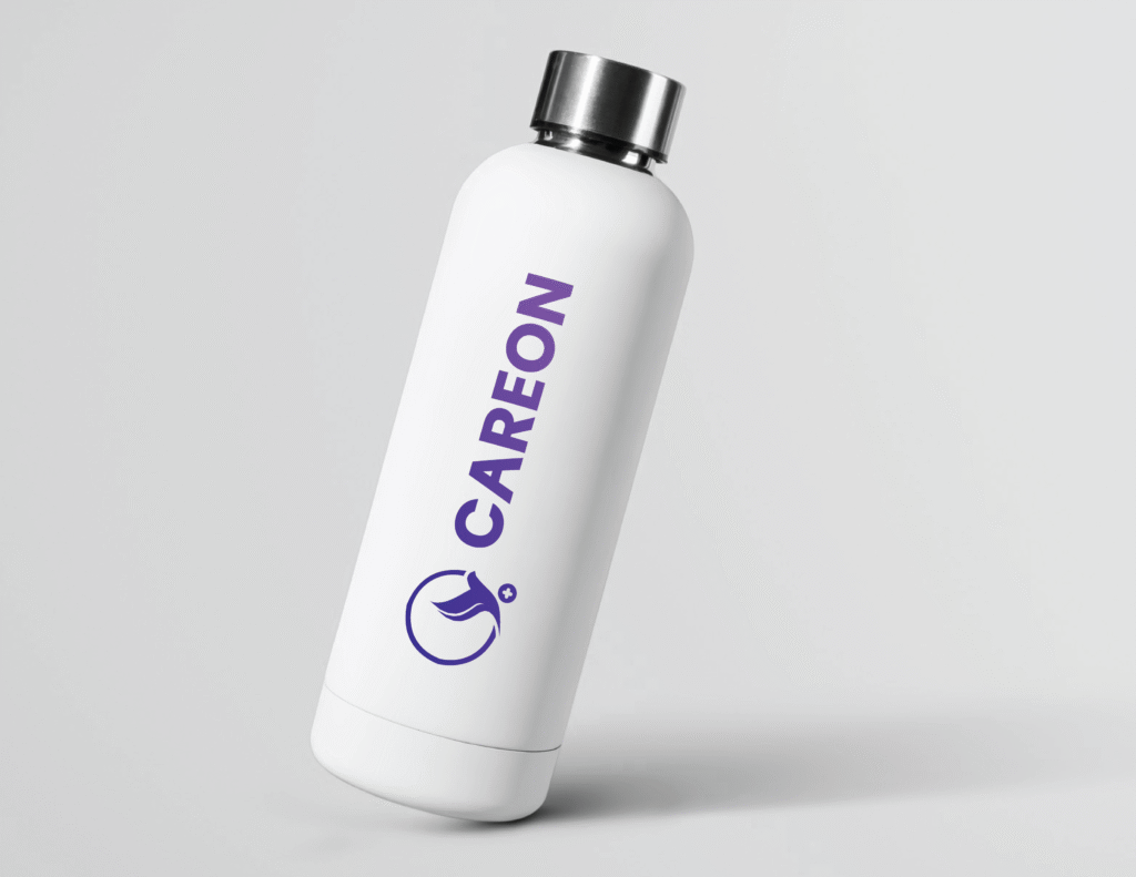
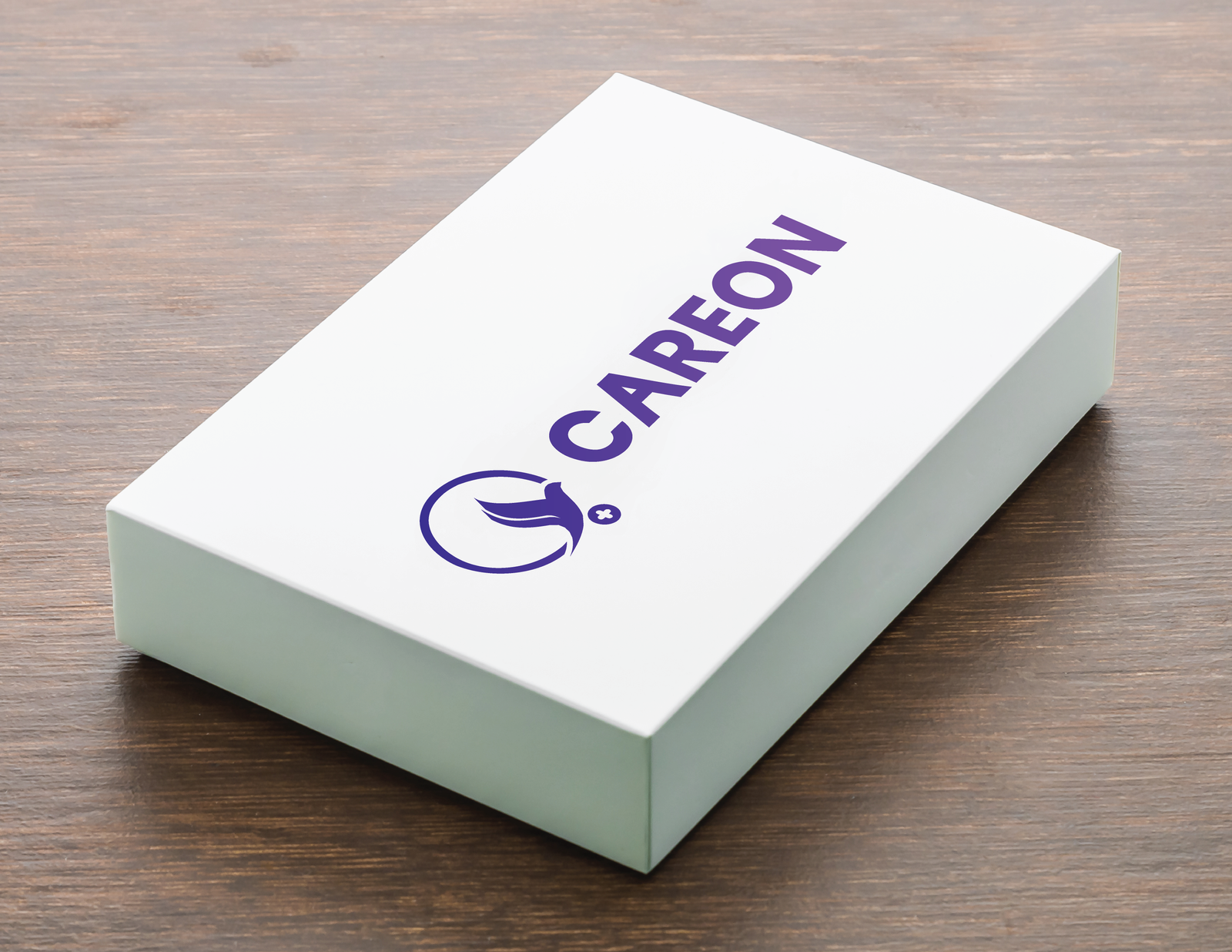
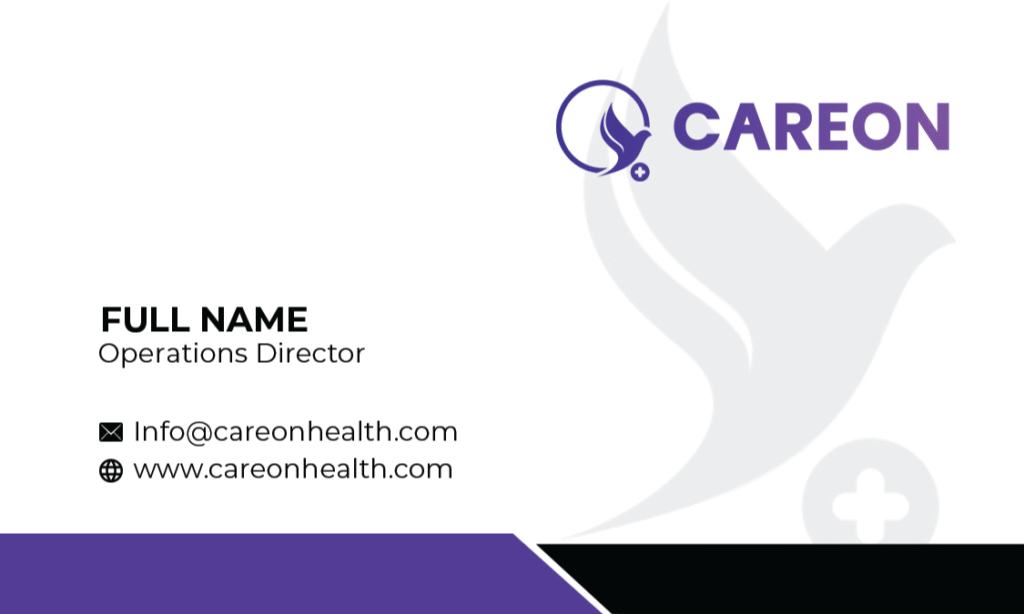
Stationery
Merch & Digital Ads