Problem
The client struggled with limited brand visibility in the local area and had no website to showcase their services or connect with potential customers. Without an online presence, they missed opportunities to inform customers about their offerings and build brand recognition. A website could serve as a vital touchpoint, giving potential clients easy access to information, service details, and contact options, while improving the brand’s credibility and reach within the local market.
Solution
To address this, I recommended creating a strong online presence with a well-designed website, optimized for local search, to attract and inform customers about their offerings. This approach helps establish brand recognition and provides a central hub for customers to explore services, strengthening their overall market presence.
Goals for Company
Lam & Company’s goal is to position itself as a trusted, full-service CPA firm for individuals, small to mid-sized businesses, and international clients. By expanding its local presence and strengthening its brand identity, the firm aims to attract new clients while continuing to provide personalized, professional financial services.
Brand Strategy
The brand strategy is centered on establishing Lam & Company as a reliable, community-focused CPA firm with global capabilities. Messaging focuses on personalized service, technical expertise, and long-term partnership. The tone is confident yet approachable, with a visual identity that’s calm, grounded, and professional. This strategy was designed to reflect the firm’s integrity and expand its appeal to a broader client base.
Color
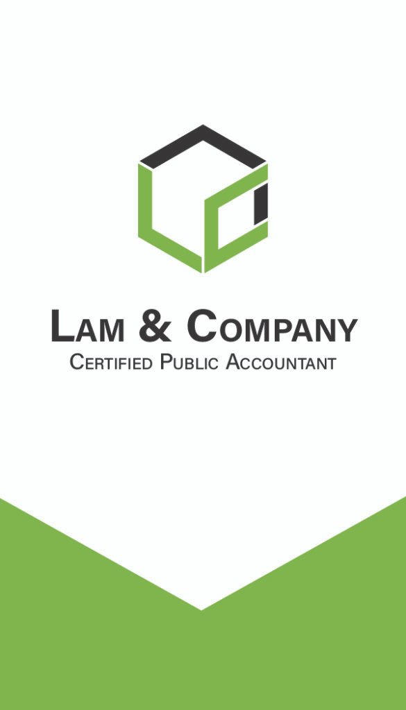
The logo for Lam & Company uses a refined, minimalist type treatment complemented by a sage green color palette. Sage green was chosen for its calming and professional qualities, symbolizing wisdom, stability, and growth. This choice helps convey financial trustworthiness while offering a fresh, modern look that sets the firm apart from more traditional CPA branding.
SAGE GREEN
HEX
#7AB142
RGB
(122, 177, 66)
CYMK
(58%, 9%, 100%, 1%)
DARK SAGE GREEN
HEX
#468803
RGB
(70, 136, 3)
CYMK
(76%, 24%, 100%, 10%)
DEEP GRAY
HEX
#3A3A3A
RGB
(58,58, 58)
CYMK
(69%, 62%, 61%, 52%)
PURE BLACK
HEX
#000000
RGB
(0,0, 0)
CYMK
(0%, 0%, 0%, 100%)
Typeface & Hierarchy
The typography features a clean, serif-sans combination, such as Poppins for headers with Roboto Mono for body text. This pairing offers a balance between classic and modern readability. The typefaces enhance the firm’s credibility while keeping the brand inviting to a broad range of clients.
Poppins
Aa
Bold
Aa
Semibold
Aa
Regular
Aa
Extra Light
Roboto Mono
Aa
Bold
Aa
Semibold
Aa
Regular
Aa
Extra Light
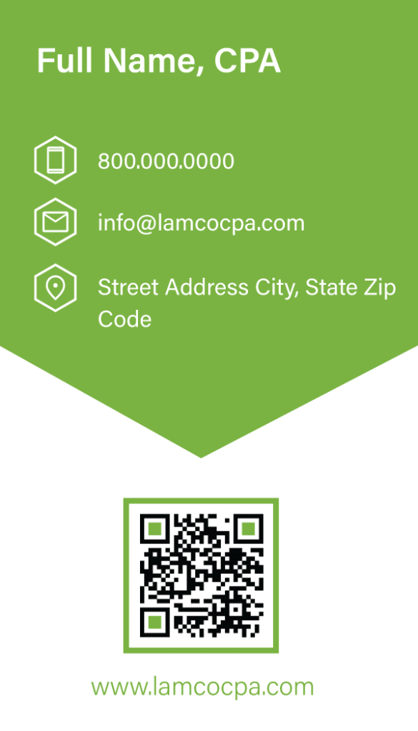
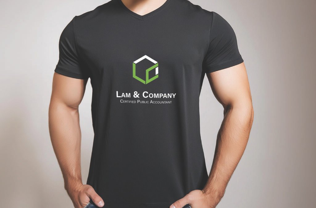
Stationery